As I write this, it’s half past four in the afternoon and almost completely dark outside. No, I’m not experiencing an eclipse, Claudia and I are in Germany. Yes, we brought the kids with us. You’d be surprised how many people asked me if we were going on holidays with our girls as if there was the option of some sort of boarding kennels for infants available that we were not considering. Mind you, after going through the hell that was the flight over here, we may not bring them home with us.
Germany is a country that’s renowned for leading the world in all sorts of areas with brands like Mercedes Benz, Miele, BMW and Bosch just to name a few. They don’t lead the world in share ownership on a per capita basis though.
Thanks to floats of big Aussie companies like Telstra, the Commonwealth Bank and AMP, the level of share ownership in Australia remains among the highest per capita of any country in the world. We also have a much higher percentage of our super invested in shares than most other countries have invested in their equivalent retirement vehicles. And yet, when it comes to information about share prices, there’s one area we fall behind the Germans.
Watch any TV news bulletin and you will see that the finance report focuses on how much the share market went up or down by since its last close. There is rarely info telling you how much it’s risen or fallen by in the last week, fortnight or month, which I find annoying as the day to day price changes mean bugger all in the long term. They only serve to make people shit themselves if they’ve just seen a 1-2% fall in the value of their investment.
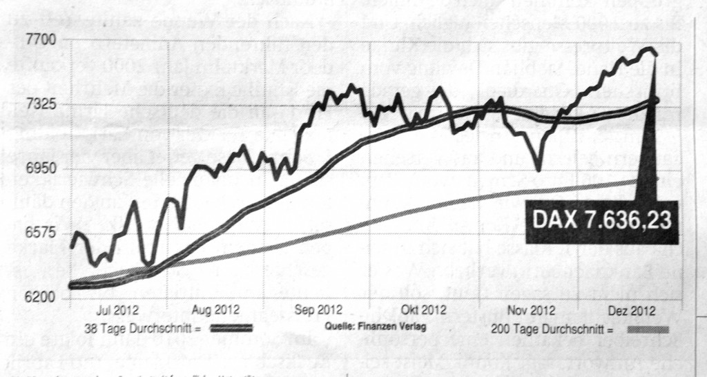
A much better approach is the one the Germans take. Have a good look at the graph below and the first thing you’ll notice is that it’s in German. Allow me to translate.
The DAX is the German stock exchange (the equivalent of the ASX – the Australian Stock Exchange). The single black line is how much shares are jumping around by on a daily basis. Tage Durchschnitt means days average, so the double black line shows an average over 38 days, the grey line is an average over 200 days. That grey line is the bit I find most helpful as it really shows a trend over a longer time period, cutting out the noise of all the jagged daily spikes. As shares are an investment that should only ever be held over the long term, it’s the information that should carry the most weight with shareholders and potential shareholders.
Ideally, graphs like these would show even longer trends – over one, two, three, five and seven years, and the people who own these share would only be concerned with how these companies perform over the long term. Until that day comes, just remember that there’s more to German ingenuity than autobahns and great beer.
Gesundes neues Jahr! (You’ll need to Google that for a translation.)


